Know-How
This section will provide you with all the necessary information to understand and complete the Module 4 - Advanced Predictions which will be mostly about creating regressions and making meaningful charts out of their outcomes.
Guide on regression
What is regression analysis?
Explanation
Suppose you’re a sales manager trying to predict next month’s numbers. You know that dozens, perhaps even hundreds of factors from the weather to a competitor’s promotion to the rumor of a new and improved model can impact the number.
Perhaps people in your organization even have a theory about what will have the biggest effect on sales. “Trust me. The more rain we have, the more we sell.” “Six weeks after the competitor’s promotion, sales jump.”
Regression analysis is a way of mathematically sorting out which of those variables does indeed have an impact. It answers the questions: Which factors matter most? Which can we ignore? How do those factors interact with each other? And, perhaps most importantly, how certain are we about all of these factors?
In regression analysis, those factors are called variables. You have your dependent variable — the main factor that you’re trying to understand or predict. In example above, the dependent variable is monthly sales. And then you have your independent variables — the factors you suspect have an impact on your dependent variable.
How does it work?
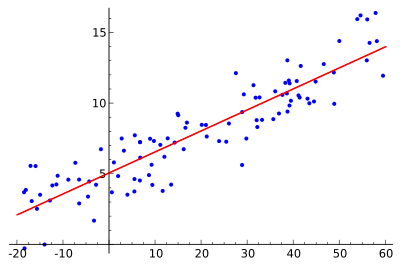
In order to conduct a regression analysis, you gather the data on the variables in question. (Reminder: you likely don’t have to do this yourself, but it’s helpful for you to understand the process your data analyst colleague uses.) You take all of your monthly sales numbers for, say, the past three years and any data on the independent variables you’re interested in. So, in this case, let’s say you find out the average monthly rainfall for the past three years as well.
The y-axis is the amount of sales (the dependent variable, the thing you’re interested in, is always on the y-axis) and the x-axis is the total rainfall. Each blue dot represents one month’s data—how much it rained that month and how many sales you made that same month.
Glancing at this data, you probably notice that sales are higher on days when it rains a lot. That’s interesting to know, but by how much? If it rains 3 inches, do you know how much you’ll sell? What about if it rains 4 inches?
The maths behind a regression
Now imagine drawing a line through the chart above, one that runs roughly through the middle of all the data points. This line will help you answer, with some degree of certainty, how much you typically sell when it rains a certain amount.
This is called the regression line and it’s drawn (using a statistics program like SPSS or STATA or even Excel) to show the line that best fits the data. In other words, “The red line is the best explanation of the relationship between the independent variable and dependent variable.”
In addition to drawing the line, your statistics program also outputs a formula that explains the slope of the line and looks something like this:
y = 200 + 5x + error term
Ignore the error term for now. It refers to the fact that regression isn’t perfectly precise. Just focus on the model:
y = 200 + 5x
What this formula is telling you is that if there is no x then y = 200. So, historically, when it didn’t rain at all, you made an average of 200 sales and you can expect to do the same going forward assuming other variables stay the same. And in the past, for every additional inch of rain, you made an average of five more sales. “For every increment that x goes up one, y goes up by five”.
Rather the line is an estimate based on the available data. So the error term tells you how certain you can be about the formula. The larger it is, the less certain the regression line.
The above example uses only one variable to predict the factor of interest — in this case rain to predict sales. Typically you start a regression analysis wanting to understand the impact of several independent variables. So you might include not just rain but also data about a competitor’s promotion.
When you include multiple independent variables, then it is called multiple regression. In order to choose your independent variables, it is helpful to look at the heatmap with the correlations. Once you find variables with high correlation with the target variable, you can build your multiple regression.
How do companies use it?
Whats the benefit?
Regression analysis is the “go-to method in analytics,”. And smart companies use it to make decisions about all sorts of business issues. “As managers, we want to figure out how we can impact sales or employee retention or recruiting the best people. It helps us figure out what we can do.”
What cases?
Most companies use regression analysis to explain a phenomenon they want to understand (e.g. why did customer service calls drop last month?); predict things about the future (e.g. what will sales look like over the next six months?); or to decide what to do (e.g. should we go with this promotion or a different one?).
A note about “correlation is not causation”: Whenever you work with regression analysis or any other analysis that tries to explain the impact of one factor on another, you need to remember the important adage: Correlation is not causation. This is critical and here’s why: It’s easy to say that there is a correlation between rain and monthly sales.
The regression shows that they are indeed related. But it’s an entirely different thing to say that rain caused the sales. Unless you’re selling umbrellas, it might be difficult to prove that there is cause and effect.
Source : https://hbr.org/2015/11/a-refresher-on-regression-analysis