Mission 12 - Regression Revisited
Estimated time for completing this mission: 20 mins
Learning Objective
Create a regression model app in LOGIBLOX to present regression analysis results in an easily interpretable way.
Scenario
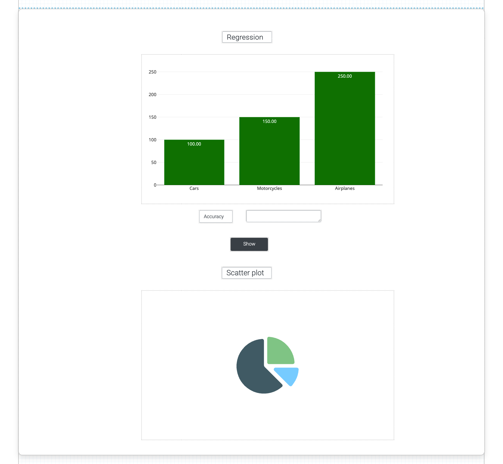
You need to create a regression analysis app for non-technical users. The app should display regression results with clear visualizations comparing predicted values against true values.
BLOX used in this mission:
Logic BLOX
- MyData/FinalData
- AI/Regression Model
App Templates
- Chart (2x)
- Panel
- Label (2x)
- Button
Data
The same data set will be used as for the previous exercise. In case you do not have the data set you can download it here: FinalData.xlsx
Steps
Please refer to the Navigation Guide to perform the steps below
App Designer:
Create Regression App
- Import dataset from the Data section to Module5 folder
- In Module5, create a new app named Regression Revisited
- Drag a Panel template onto the canvas and make it large enough to fit two Chart templates inside
- Drag two Chart templates into the Panel side by side
- Add two Label templates below the charts: one with text "Accuracy:" and one empty label for displaying the accuracy value
- Add a Button template to trigger the regression logic
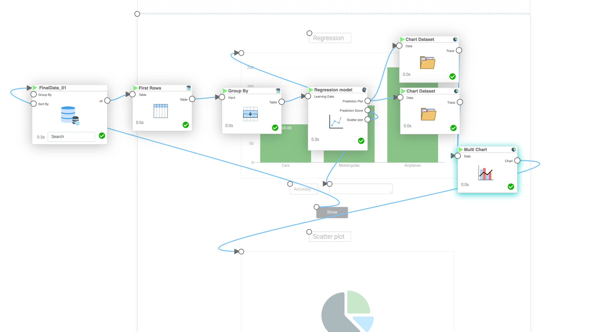
- Click the flask icon to create a new logic flow and name it "Regression"
Build Regression Logic
- In the logic flow, drag the "MyData" BLOX
- In the "MyData" BLOX settings, set "Limit" to 200
- In the "MyData" BLOX settings, configure "Group By" to "ORDERDATE". Then click the + button after "Aggregation", select "all" in the first dropdown and "Average" in the second dropdown
- Connect the "MyData" BLOX to "Regression Model" BLOX. In the "Regression Model" BLOX settings, set "Features" to "ORDERDATE", "Target" to "SALES", "Regression Type" to "Quadratic", "Feature is time series" to "yes", and name the model "Quadratic Model"
- Connect the "Button" template to the "MyData" BLOX in the logic
- Connect the "Line Chart" output from the "Regression Model" BLOX to the first Chart template in the app
- Connect the "Scatter Plot" output from the "Regression Model" BLOX to the second Chart template in the app
- Connect the "Prediction Score" output from the "Regression Model" BLOX to the empty accuracy Label template
- Run the app and click the button to display the regression results with accuracy score
Results and Summary
