Mission 1 - KPI Dashboard
Estimated time for completing this mission: 20 mins
Learning Objective
After your previous introduction into the LOGIBLOX app designer, you will now create your first dashboard - logic free! You should feel comfortable with the basic concepts of the app designer and be able to create a simple dashboard with a line chart, a tree map and some data filters. This is a great starting point for more advanced dashboards and apps that leverage the same blox/concepts.
Scenario
We curated a close-to-real-life sales dataset for you to create some basic and advanced charts a as part of a dynamic dashboard. You should be able to gain insights into the sales data and answer questions such as which product is the most popular one, which state is the most successful one and how the sales are distributed over time.
Data
Import this prepared LOGIBLOX project: Mission 1 - KPI Dashboard.lbx into your module three folder or home directory.
In it you will find the necessary data - the Sales Data - as well as a pre-built app - Sales KPI Dashboard (Template) with some sticky notes to guide you through the process. There is also a file called: Sales KPI Dashboard (Solution) which is helpful if you get stuck or want to compare your solution to ours.
Description
As mentioned previously, the data for this mission is part of a larger sales dataset from a large US-based retailer. We picked seven relevant columns to create a dynamic dashboard with a basic line chart, a more advanced tree map chart and data filters/slicers. Consider the data in the Data Manager in detail, to get familiar with it.
Structure
The dataset is structured as follows:
| Column Name | Country | State | City | Order Date | Category | Sub-Category | Sales |
|---|---|---|---|---|---|---|---|
| Column Type | Text | Text | Text | Date (MM/DD/YYYY) | Text | Text | Whole Numbers |
| Example | United States | Kentucky | Henderson | 1/3/2014 | Furniture | Bookcases | 262 |
BLOX used in this mission:
For this mission, you'll need the following App Blox:
| Image | Label | Dropdown | Slider | Chart | Panel |
|---|---|---|---|---|---|
| 1x | 7x | 4x | 1x | 2x | 3x |
Goal
Steps
There are three tasks outlined in the template. Carefully read through the instruction in the Sticky Notes Blox. Follow these steps to complete the mission. Start with the line chart, then the tree map and finally the data filters.
Task 1: Line Chart
Step-by-step guide
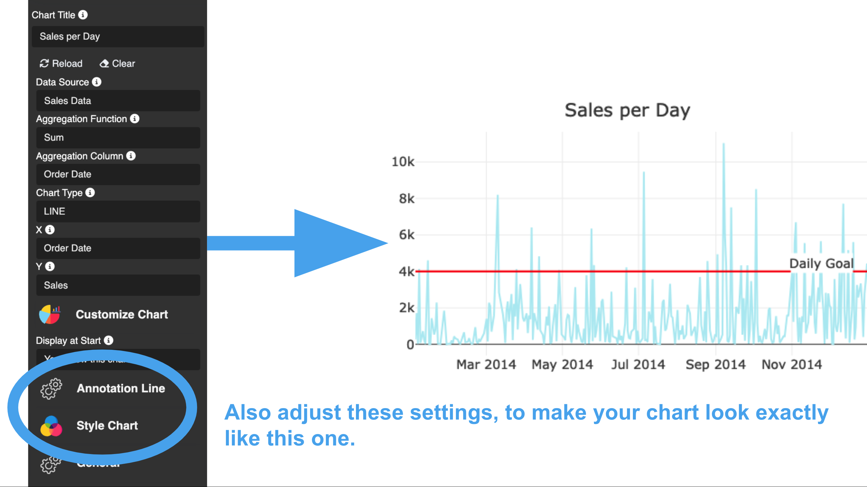
- Right click and insert a Chart Blox onto the panel to the bottom left. Adjust the size of the chart to fit the panel nicely by dragging the corners of the chart blox.
- Double click the chart blox. This reveals the blox settings in a panel on the left. Go through the settings and adjust them as follows:
- Select the Sales Data as the data source
- Next, set the chart type for this chart to LINE. This will reveal further chart type specific settings. For example you have to specify the x-axis and y-axis columns for a line chart.
- Since the goal is to plot the sales vs. time, the sales per day need to be summed up. Otherwise there could be multiple values for the same x-axis value. Therefore, set the Function to Sum and select the Order Date column as the column to be aggregated. This will automatically sum up all numeric columns in the data source.
Once you provide a minimal set of settings, the chart will be rendered in the preview window. You can now adjust the settings to your liking. For example, you can change the color of the line, the color of the background, the font size and so on.
Task 2: Treemap Chart
The steps for this task are very similar to the previous one. The only difference is that you have to select a different chart type and the associated settings are different, i.e. you have to specify a value column and a set of hierarchical columns for the tree map chart.
Step-by-step guide
Task 3: Drop-down and Slider Blox for data filtering
To filter for data, we suggest you use drop-down and slider blox. The drop-down blox can be used to filter for categorical data, e.g. the Category column. The slider blox can be used to filter for numerical data, e.g. the Sales column.
Simply bind these blox to their respective column in the same data-source as the chart blox and you are good to go. The blox will automatically update the chart once you change the value in the drop-down or slider.
Step-by-step guide