Mission 10 [Own Mission] - Deeper Supplier Insights
Estimated time for completing this mission: 10mins
Learning Objective
Learning how you can reuse the same data to produce different charts.
Scenario
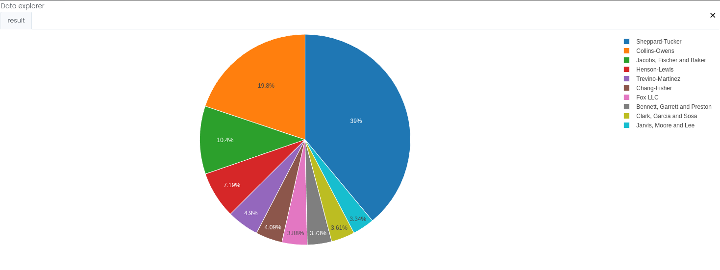
We can now continue with this dataset and create a pie chart describing the top ten suppliers according to the aggregated spending. This chart will allow you to understand the business even better.
BLOX used in this mission:
- Basics/Start
- MyData/data_with_suppliers
- Database/View
- Charts/Pie Chart
- Basics/Display
Data
In this mission we will use the prepared dataset from the previous section.
If you have not created it, here is a link for the dataset data_with_suppliers.xlsx
Steps
Please refer to the Navigation Guide to perform the steps below
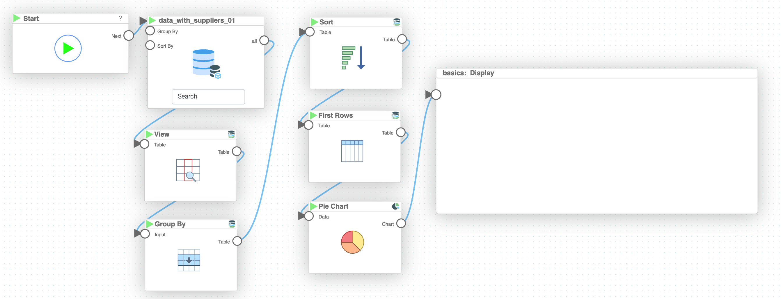
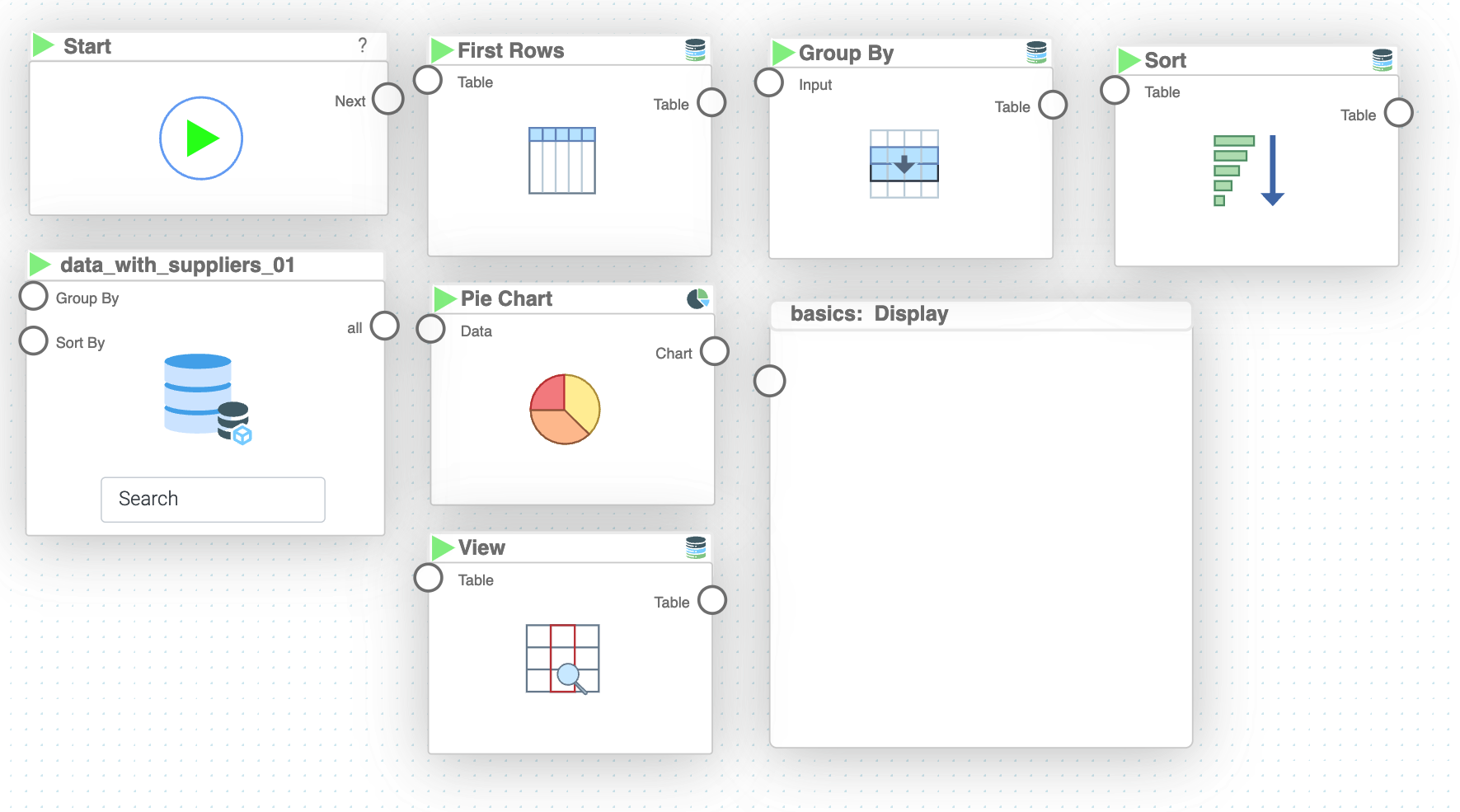
- In the Flow builder, drag-and-drop all the necessary BLOX listed above
- Connect the BLOX in sequence: "Start" → "MyData" → "View" → "Pie Chart" → "Display"
- In the "MyData" BLOX settings, filter the "Amount" column by clicking the eye icon next to it and selecting "Greater Than" with value 0
- In the "MyData" BLOX settings, configure grouping by setting the "Group By" column to "Supplier". Then click the + button after "Aggregation", select "all" in the first dropdown and "sum" in the second dropdown
- In the "MyData" BLOX settings, configure "Sort By" by specifying "Amount" as the sorting column and set the order to "Descending"
- In the "MyData" BLOX settings, set "Limit" to 10 to get only the top 10 suppliers
- In the "View" BLOX settings, specify the columns to extract: "Supplier" and "Amount"
- In the "Pie Chart" BLOX settings, set Label to "Supplier" and Value to "Amount", and set "Show Legend" to "yes"
- Press the play button on "Start" BLOX to see the results in "Display" BLOX
Tip
You can zoom in the graph by clicking "Zoom" button in the top right corner of the "Display" BLOX
Results and Summary
You can now easily analyze the spending done on each of the suppliers.