Mission 11: Analytics
Learning Objective
Learn how to gain quick insights and understanding of your data using the built-in analytics features.
Dataset
Download the required dataset: new_table_cars.xlsx
Step-by-Step Instructions
1. Open Your Dataset
First, open the data you want to analyze.
2. Access the Analytics Dashboard
Click on the analytics button to open the analytics features.

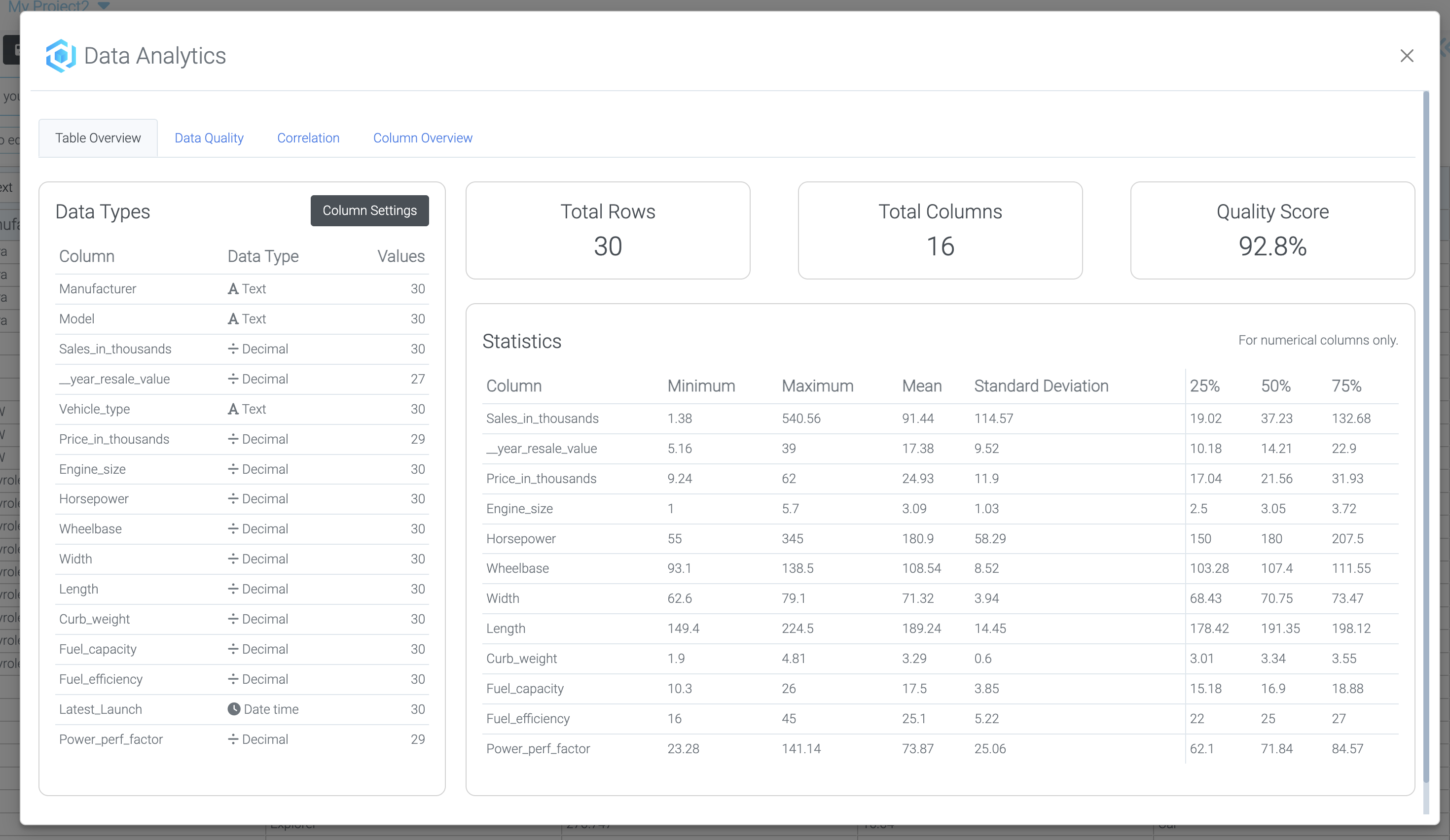
3. View Table Overview
After clicking analytics, you'll see the table overview with summary statistics.
Correlation Analysis
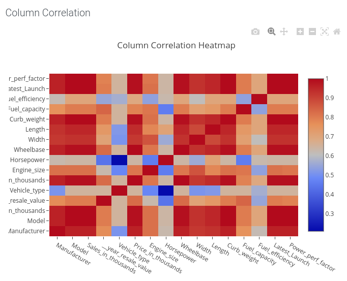
4. Access Correlation Chart
Click "Correlation" in the top menu to view relationships between variables.
Column-Level Analytics
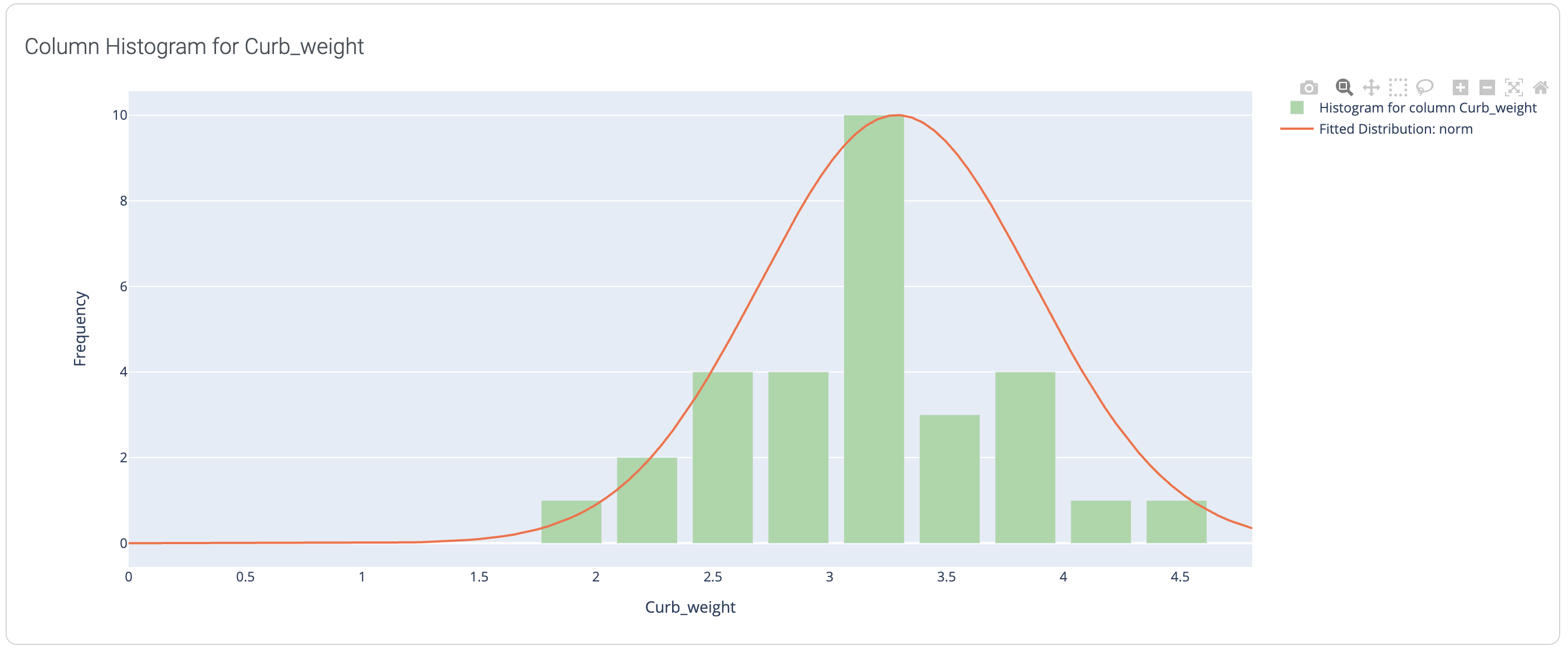
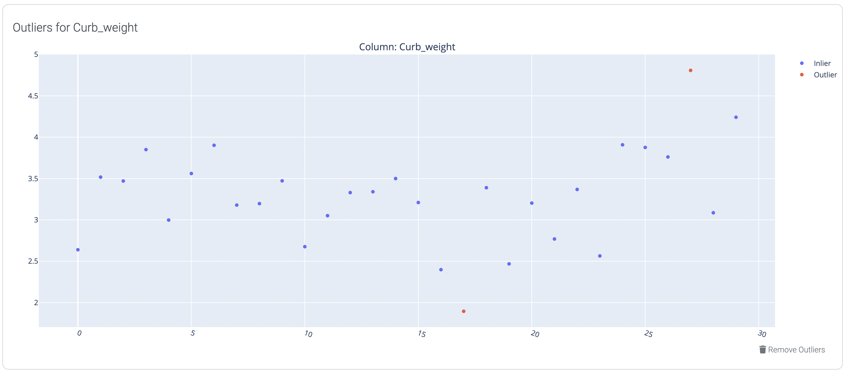
5. Access Column Overview
Click on the "Column Overview" tab to analyze individual columns.
6. Select and Analyze Columns
Select a column to see various charts and detailed information about that specific column.
Available Visualizations
Distribution Analysis
Outlier Detection
Box Plots

Statistical Summaries

Analytics Features Summary
| Feature | Purpose | Available For |
|---|---|---|
| Table Overview | General statistics and summary | All datasets |
| Correlation Chart | Identify relationships between variables | Numerical columns |
| Distribution Analysis | Understand data spread and patterns | All column types |
| Outlier Detection | Find and manage extreme values | Numerical columns |
| Box Plots | Visualize distribution and outliers | Numerical columns |
| Histograms | Show frequency distributions | Categorical and numerical columns |
Summary
You've successfully learned how to:
✓ Access the analytics dashboard
✓ View table overview and summary statistics
✓ Analyze correlations between variables
✓ Explore individual column analytics
✓ Use distribution curves and box plots
✓ Detect and manage outliers
✓ Interpret different visualizations based on data types
Congratulations!
You've completed all missions in Module 0: Data Management Fundamentals. You now have a solid foundation in working with data in LOGIBLOX.